My Portfolio
Brand Design for The Point of Loyalty
Client: The Point of Loyalty.
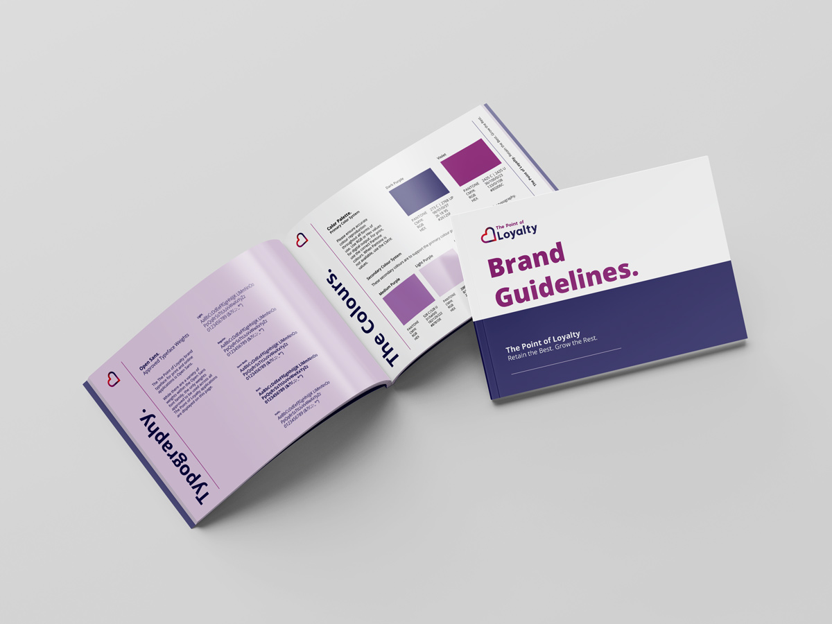
Brief: Undertake a rebranding process for The Point of Loyalty to achieve a more contemporary and distinctive identity that stands out from competitors. The rebrand should incorporate the existing brand colours while introducing a primary purple colour to convey loyalty and trust. The new brand identity should reflect trust, experience, and loyalty, while maintaining a clean and simple design with rounded elements. It should also include a symbol or brandmark . The brand needs to appeal to the target audience of corporate professionals and marketers. Additionally, a comprehensive style guide is required.
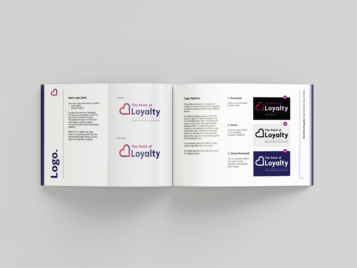
Result: The rebrand for The Point of Loyalty successfully met the brief, resulting in a remarkable transformation that garnered overwhelming praise and positive feedback from the client and stakeholders.. The client expressed immense satisfaction, sharing numerous compliments and positive feedback on the new brand. The design lends itself well to various applications, including website design, blog articles, proposals, and reports. The heart icon, representing loyalty, was a highlight of the brand identity. It consisted of three colours, with the top shape resembling a reversed figure three, symbolizing the three stages of the customer journey. The chosen Pantra font complemented the curves of the heart icon, creating a harmonious visual connection. The colour palette aligned with the current logo, maintaining brand continuity. The client was so pleased with the rebrand that they requested further design work, including blog header designs, a PowerPoint template, and website design.
Skills: Branding, Logo Design, Graphic Design, Web Design, Typography, Style Guide, Corporate Identity ,Logo Refresh.